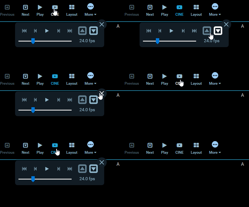
Module: Toolbar
An extension can register a Toolbar Module by defining a getToolbarModule
method. This module is commonly used to define:

Example Toolbar Module
The Toolbar Module should return an array of definitions and a
defaultContext. There are currently a few different variations of definitions,
each one is detailed further down.
export default {
  id: 'example-toolbar-module',

  /**
   * @param {object} params
   * @param {ServicesManager} params.servicesManager
   * @param {CommandsManager} params.commandsManager
   */
  getToolbarModule({ servicesManager, commandsManager }) {
    return {
      definitions: [
        /* Array of definitions */
      ],
      defaultContext: ['ROUTE:VIEWER'],
    };
  },
};
Button Definitions
The simplest definition has the following properties:
{
  id: 'StackScroll',
  label: 'Stack Scroll',
  icon: 'bars',
  type: 'setToolActive',
  commandName: 'setToolActive',
  commandOptions: { toolName: 'StackScroll' },
},
| property | description | values |
|---|---|---|
id | Unique string identifier for the definition | * |
label | User/display friendly to show in UI | * |
icon | A string name for an icon supported by the consuming application. | * |
type | Used to determine the button's component and behavior | "setToolActive", "command" |
commandName | (optional) The command to run when the button is used. | Any command registed by a CommandModule |
commandOptions | (optional) Options to pass the target commandName | * |
context | (optional) Overrides module's defaultContext | Array of string context names |
Where a button with a type of setToolActive has an "active" styling applied
when clicked; removing the active styling from all other buttons.
Nested Toolbar Menus
You can indicate that buttons should be grouped and nested in a submenu by
including buttons property in a definition:
{
  id: 'More',
  label: 'More',
  icon: 'ellipse-circle',
  buttons: [
    {
      id: 'cstInvert',
      label: 'Invert',
      icon: 'circle',
      type: 'command',
      commandName: 'invertViewport',
    },
  ],
},

Custom Components
The Toolbar Modules supports rendering custom components in place of the
application's default. In place of the type, commandName, and
commandOptions properties, we instead specify a CustomComponent.
{
  id: 'Custom',
  label: 'Custom',
  icon: 'custom-icon',
  CustomComponent: CustomToolbarComponent,
}
The CustomComponent components will receive the following props:
<CustomComponent
  parentContext="{parentContext}"
  toolbarClickCallback="{_handleToolbarButtonClick.bind(this)}"
  button="{button}"
  key="{button.id}"
  activeButtons="{activeButtonsIds}"
  isActive="{isActive}"
/>
| Property | Type | Description |
|---|---|---|
activeButtons | string[] | list of active buttons |
button | object | its own definition object |
key | string | React key prop |
isActive | boolean | If current button is active |
parentContext | ? | The parent component's context? |
toolbarClickCallback | func | Callback method for clicks |